
In my first studio blog post for February I am diving into a topic that's been pivotal in my artistic journey – the power of a limited palette in painting. As many of you may have noticed, certain colours recur in almost all of my artworks. This isn't a coincidence but a deliberate choice that has dramatically enhanced my colour mixing skills and the overall quality of my work.
2023 was the year I learned why less truly can be more in the world of colour.
The beauty of a limited palette was not a consideration of mine up until late 2022, when I attended a 4 day oil painting workshop with my art teacher and founder of Art School Co, Jess Le Clerc. This advice also carries through their weekly classes to all students.
Trusting the advice from Jess became one of the biggest unlocks in improving my colour mixing skills, and reduced the frequency of mixing muddy colours (although I still love those muddy colours, but they are at least intentionally muddy now!).
But what exactly is a limited palette?
A limited palette refers to the practice of using a small selection of colours to create artwork, rather than utilising the full spectrum of available colours. This approach can be applied to various media, including painting, digital art, and even photography to some extent.
Artists often select their limited palettes based on colour theory, choosing colours that offer a wide range of mixing possibilities. A classic example is the "Zorn palette," named after Swedish painter Anders Zorn, which consists of just four colours: ivory black, white, yellow ochre, and vermilion. Despite its simplicity, this palette can produce a surprisingly wide range of hues, suitable for a variety of subjects including portraits and landscapes.

The amount of colour variations you can create, even with a limited palette, is endless.
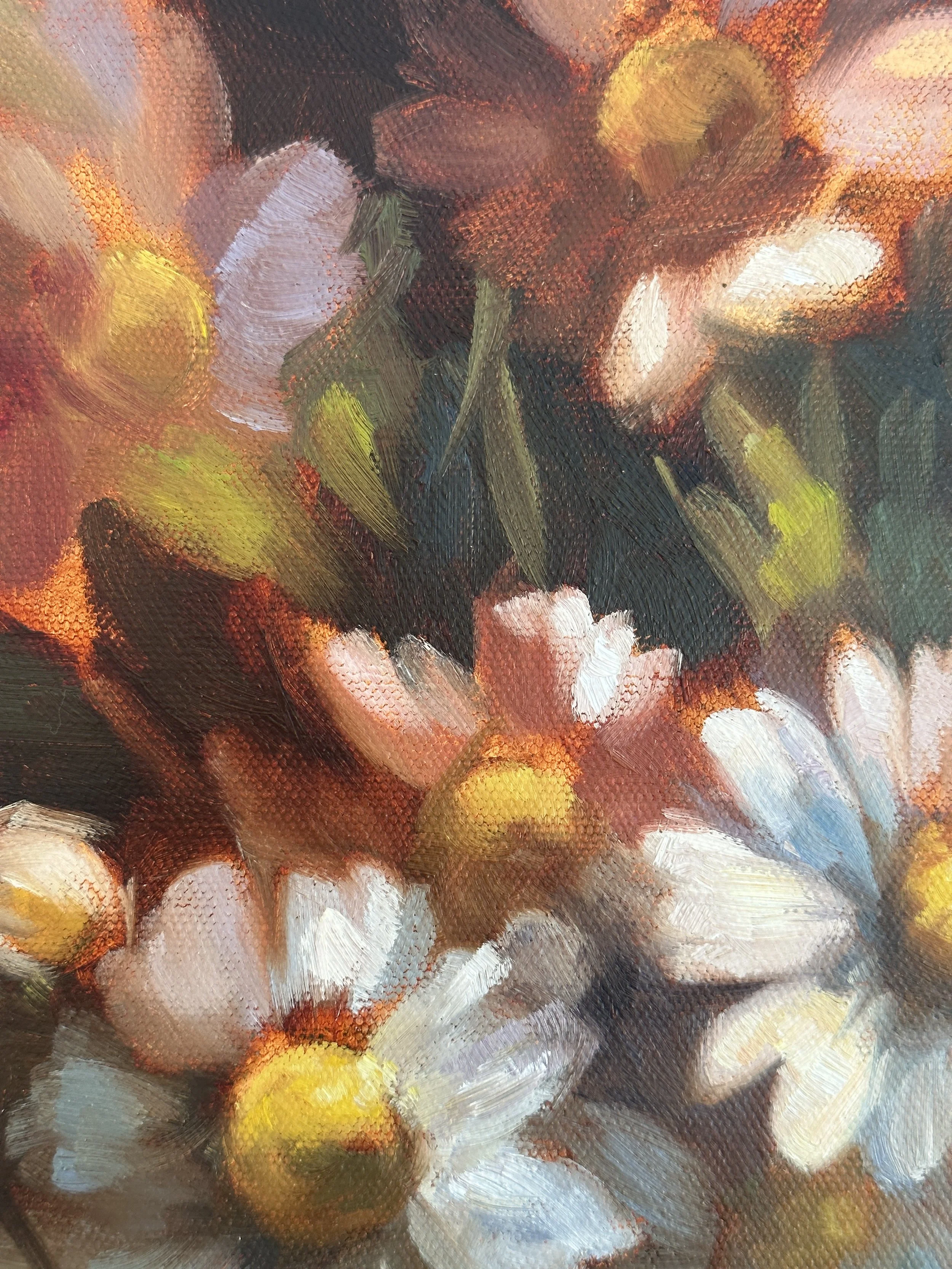
A close up of my floral oil painting titled ‘Field of Thoughts’, 2023, oil on canvas. In this close up you can see the browns, reds, yellows, purples, blues and beautiful greens, all from utilising a limited palette.
My palette consists of these colours 95% of the time, where on occasion I will include an additional colour, such as cobalt violet, pthalo blue, or magenta, depending on if the painting requires it. However, I find I can mix 95% of the colours I need from this limited palette:
Norma Professional Kings Blue
Norma Professional Cobalt Blue Hue
Norma Professional Ultramarine Blue Deep
Norma Professional Transparent Red Brown
Winsor and Newton Artist’s Permanent Alizarin Crimson
Winsor and Newton Artist’s Cadmium Red
Winsor and Newton Artist’s Cadmium Orange
Norma Professional Cadmium Yellow Light
Norma Professional Cadmium Yellow Lemon
Winsor and Newton Artist’s Yellow Ochre
Norma Professional Naples Yellow Light
Titanium White
Note: These are what I have learned to use and love, give these a go or experiment with finding the brands and colours that work for you!
I arrange my colours in the same order on my palette each time to streamline the colour mixing process. This consistent layout boosts my efficiency, allowing me to quickly locate the needed colour and effortlessly choose between warm and cool tones based on their position on the palette.
After much trial and observation, my top five advantages of using this limited palette include:
Enhanced Cohesion and Harmony:
Using a limited range of colours ensures that all the elements in my paintings are harmonious. It creates a visual consistency that is often more appealing and balanced. This approach has taught me to see the subtle variations within a few colours, bringing a sophisticated and unified look to my work.
Improved Colour Mixing Skills:
With fewer colours on my palette, I've been forced to mix almost every shade I need. This constraint has been incredibly beneficial, enhancing my understanding of colour theory and relationships. I've learned to create a wide spectrum of hues, tints, and shades from a basic set, refining my skills and deepening my appreciation for each colour's potential.
Cost-Effective and Efficient:
Working with a limited palette is also practical. It reduces the cost of supplies and simplifies the painting process. I spend less time choosing colours and more time exploring the depths of each one. This efficiency not only benefits my wallet but also allows me to focus more on the act of painting and less on the logistics.
Developing a Unique Style:
The colours we choose are a part of our artistic voice. By consistently working with a specific set of colours, I've developed a style that's distinctly mine. Viewers often recognize my work just by the colour scheme, which has been a powerful tool in building my brand and presence in the art world.
Encourages Creativity and Innovation:
It might seem counterintuitive, but having fewer colours to work with actually boosts creativity. I'm constantly finding new ways to use my limited palette, leading to innovative colour combinations and techniques. This creative problem-solving keeps my work fresh and exciting.
Embracing a limited palette has been a game-changer for my art. It has not only honed my skills in colour mixing but also helped in defining my unique style.
In essence, a limited palette is both a challenge and an opportunity, pushing artists to think creatively within boundaries and often resulting in striking and cohesive works of art.
Lastly, colour is a topic I can go on and talk about (stay tuned for my next blog post!), but if you’d love to dive deeper into the world of colour theory and advanced techniques I highly recommend reading Todd M Casey’s latest book “The Oil Painter’s Color Handbook: A Contemporary Guide to Color Mixing, Pigments, Palettes and Harmony”. Check out his website here. This is a fantastic book to read and one of my favourites so far! (I am not affiliated… I just love his book!)
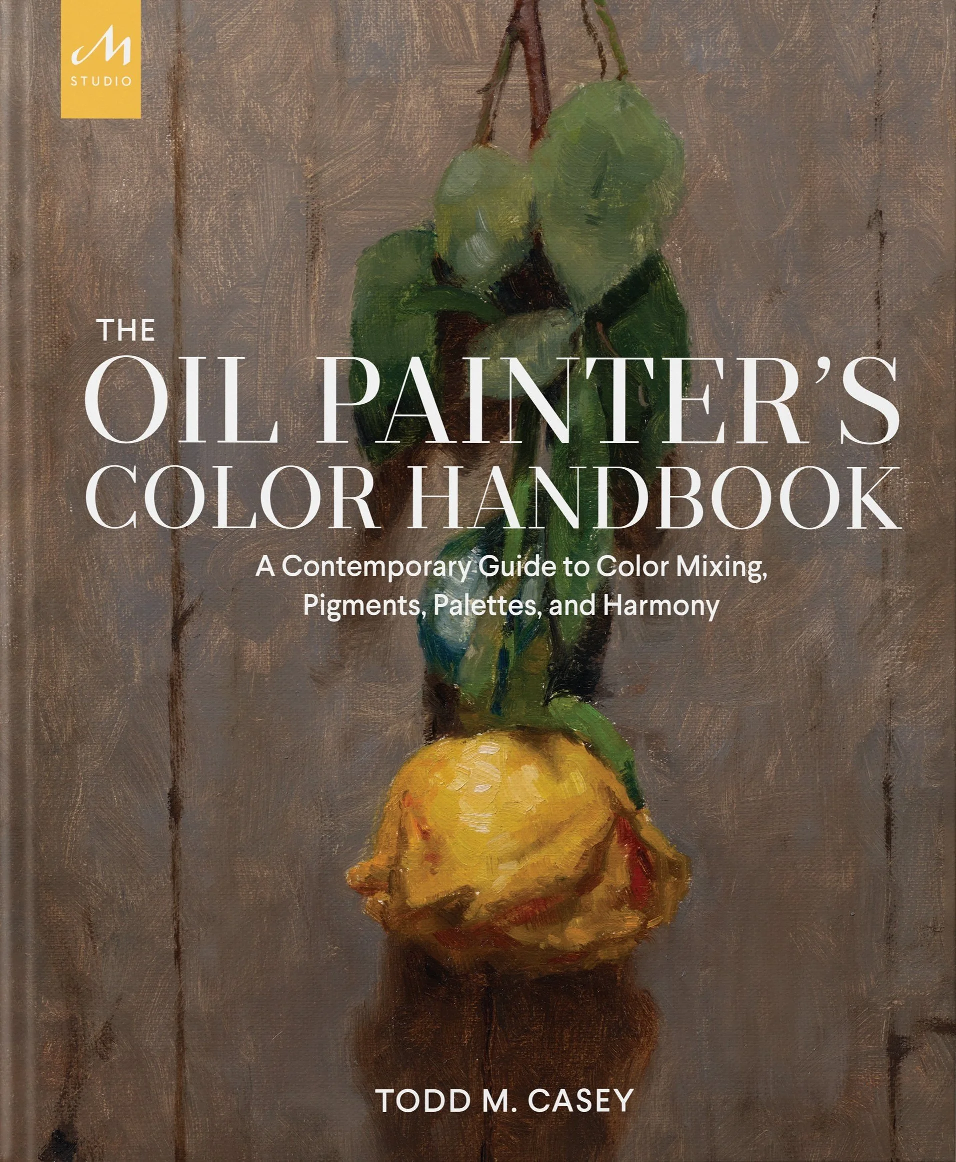
One of the best books I have read; Todd M Casey’s “The Oil Painter’s Color Handbook: A Contemporary Guide to Color Mixing, Pigments, Palettes and Harmony”.
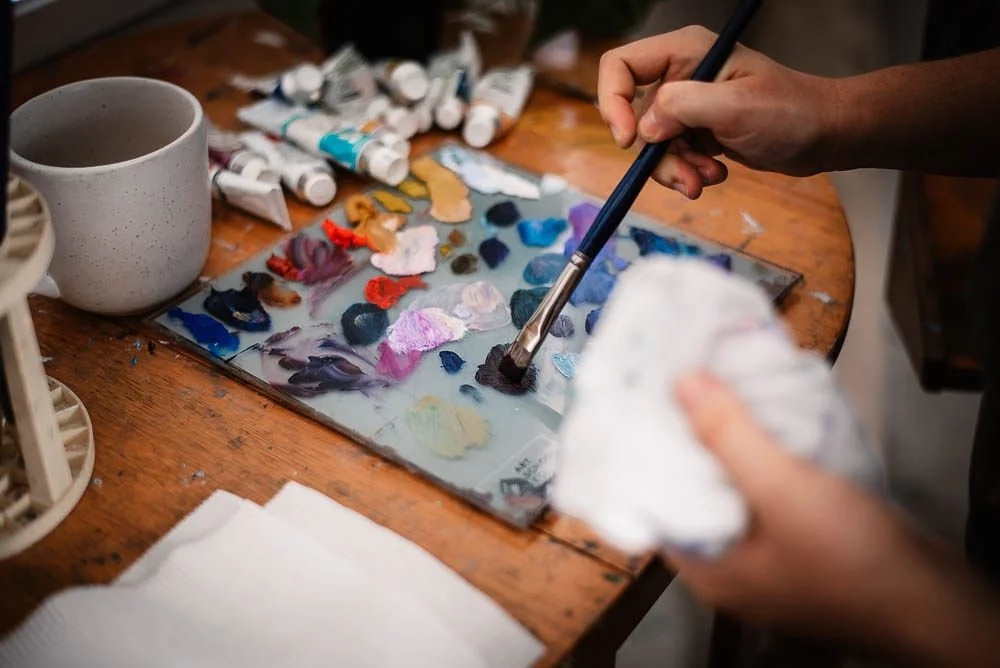
Growth in these areas is achieved not just by theoretical study or following others, but by actively applying what you learn in your own work to discover what best suits your artistic voice and preferences.
Would you like to share your own insights in using a limited palette? Leave a comment below, I would love to hear from you!
If you like reading about what goes on behind-the-scenes and my inspirations
SIGN UP TO MY NEWSLETTER FOR NEW ARTWORK ANNOUNCEMENTS, UPCOMING EVENTS AND OFFERS
